

Updated: April 5th, 2021
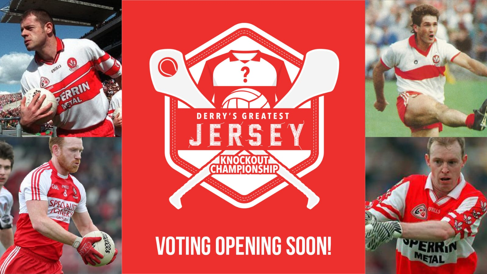
Derry’s Greatest Jersey
It’s time to get shirty… over the next couple of weeks we’re giving Derry GAA fans the chance to pick Derry’s greatest ever geansaí!
The Derry GAA strip is a pretty distinctive piece of kit.
For decades there’s been a pleasing sense of continuity to Derry’s football and hurling playing gear. The men of the 1947 National League winning side would have recognised the team of 2008 league winners as wearing fundamentally the same colours as them.

The only lasting change over the years has been the move to red togs by our footballers in the 1970s with the hurlers playing in white togs up until the last decade ago before also switching to red shorts.
Our playing jersey however has remained constant in its basic concept. Plain white with a red band unless we’re playing Tyrone, Monaghan or Kildare in which case we’ll generally tog out with the colours reversed.
However, even within the pretty rigid colour scheme of red and white there have been myriad of minor design features on Derry shirts particularly over the last 30 years.
Between, blends, flashes on the shoulders, collars, different materials and sponsors, our teams have taken the field sporting quite disparate looks – some have worked better than others.
So… we have selected 32 Derry jerseys (we only used jerseys where we could find colour pictures) from across the decades and for a bit of pre-season craic we will run a series of light-hearted social media polls over the next couple of weeks in an attempt to find our best ever geansaí.
So, whether you liked the offbeat salmon pink effect of 2002, the bells and whistles of 1992 or the classic stylings of 1987 now’s your chance to help choose Derry’s greatest ever playing shirt.
Stay tuned to our Twitter, Facebook and Instagram accounts for how to vote!
Last 32
We’ve randomly chosen the 32 entries to face off against each other in the opening knockout round, with voting taking place on our social media channels. Each winner will progress to the Last 16.
Matchup 1: 1987 vs 2003
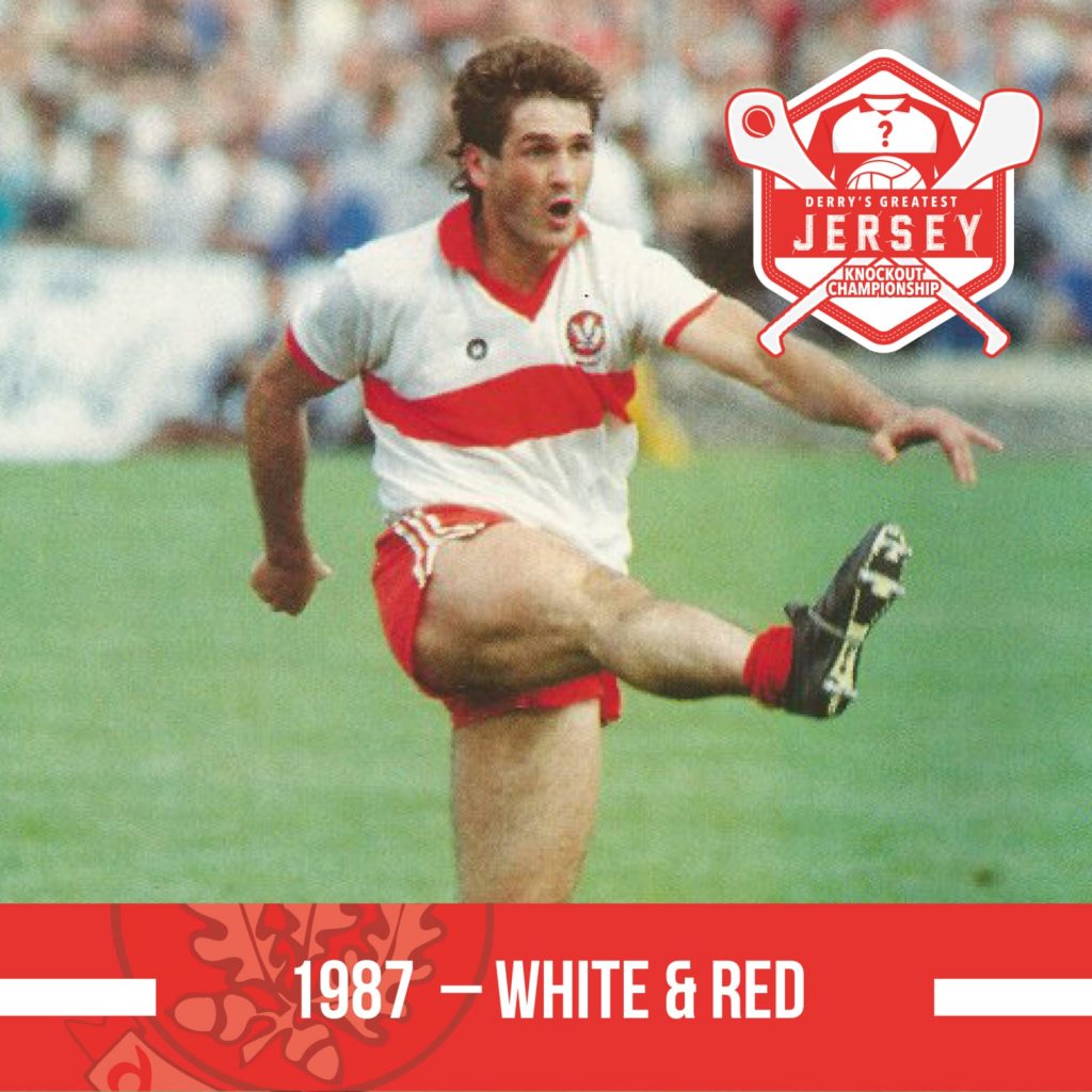
From the 1987 Ulster final – not hard to see why O’Neill’s released a retro version of this jersey last year. Classic plain jersey with red trim on the collar and the sleeves. Sometimes simpler is just better.
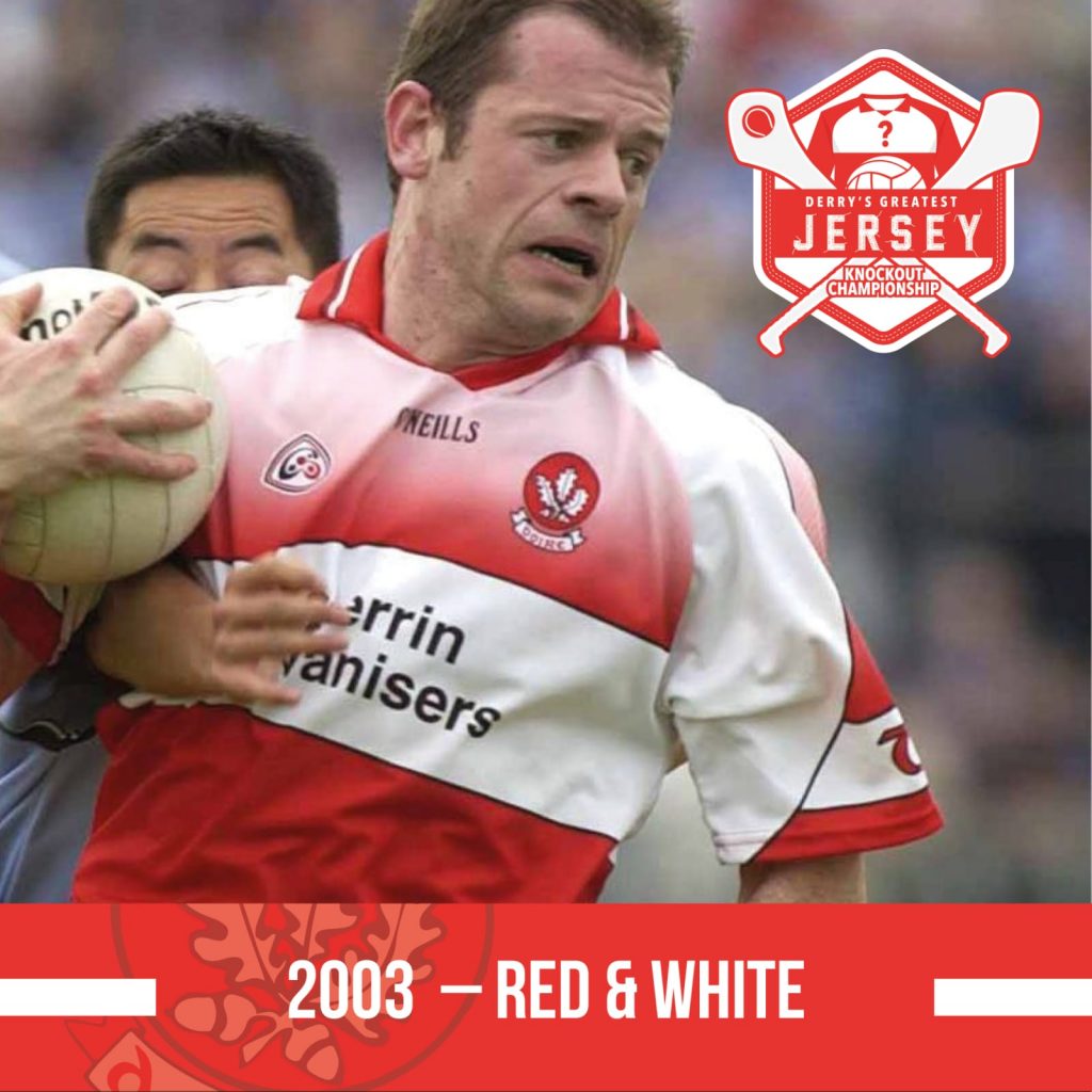
From the 2003 Championship campaign – you can see what was being tried here, the blending of the colours in the Dublin jersey created a nice effect, but with our red and white scheme it ended up looking Salmon pink. This jersey was worn against Wexford and Dublin in the football qualifiers and in the Ulster Hurling championship. By the start of 2004 it had been replaced.
WINNER: 1987
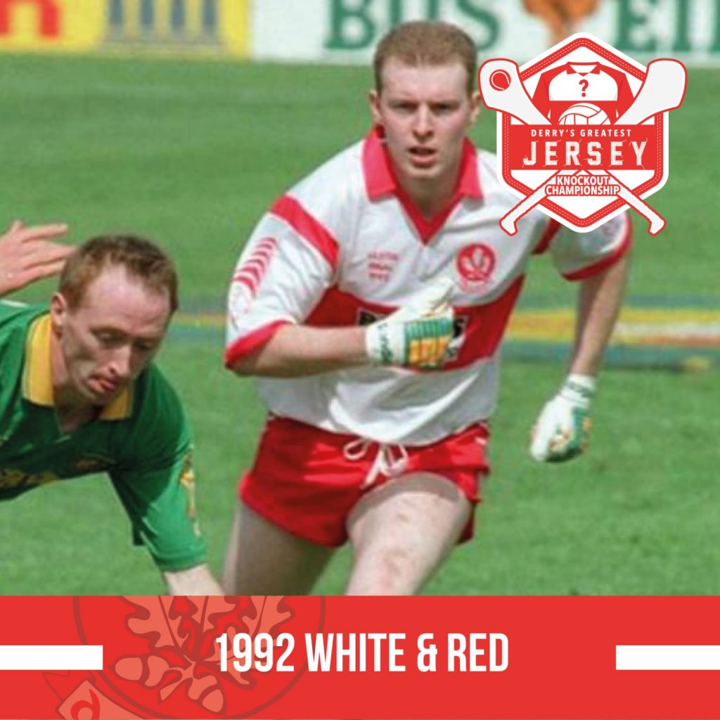
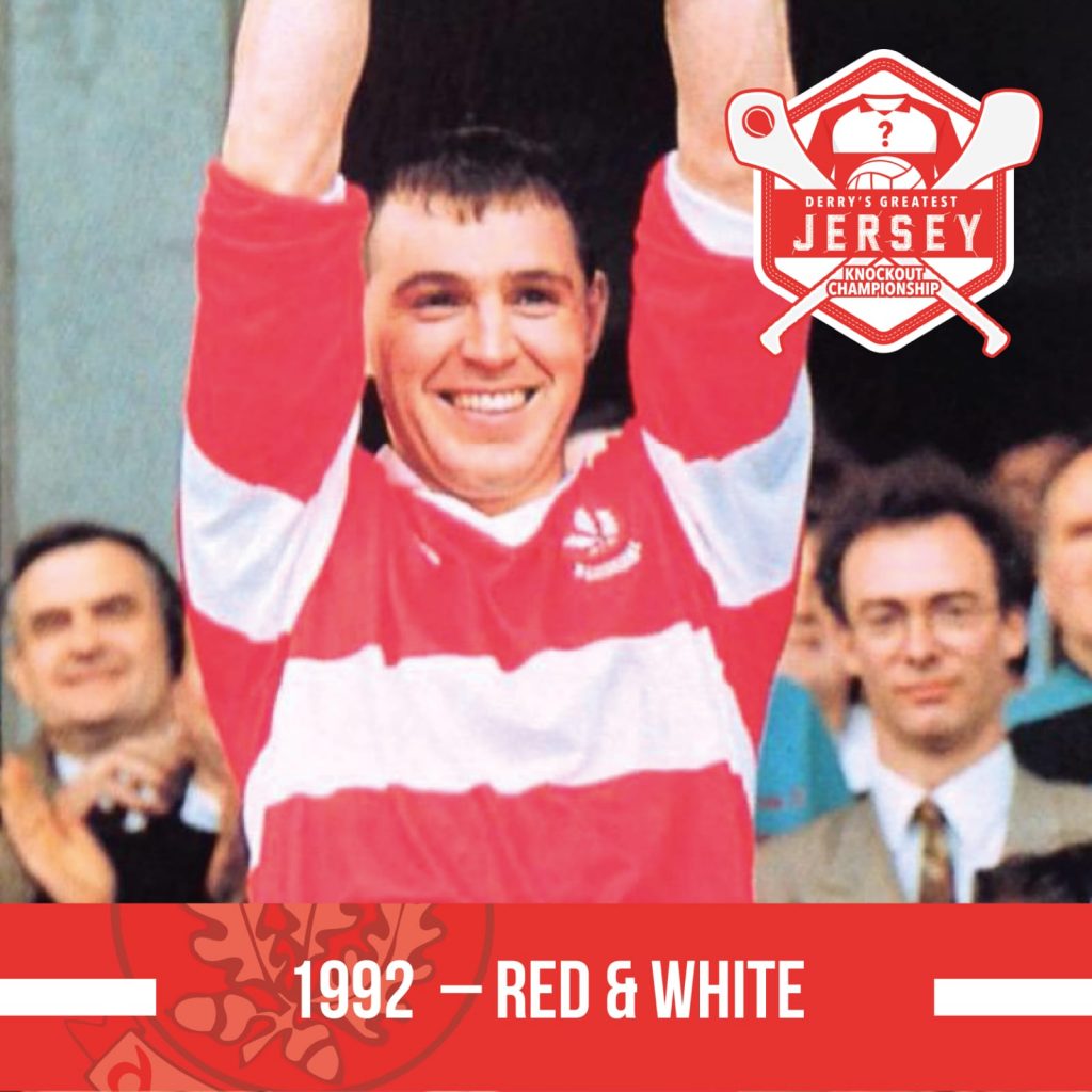
Matchup 2: 2008 v 1992
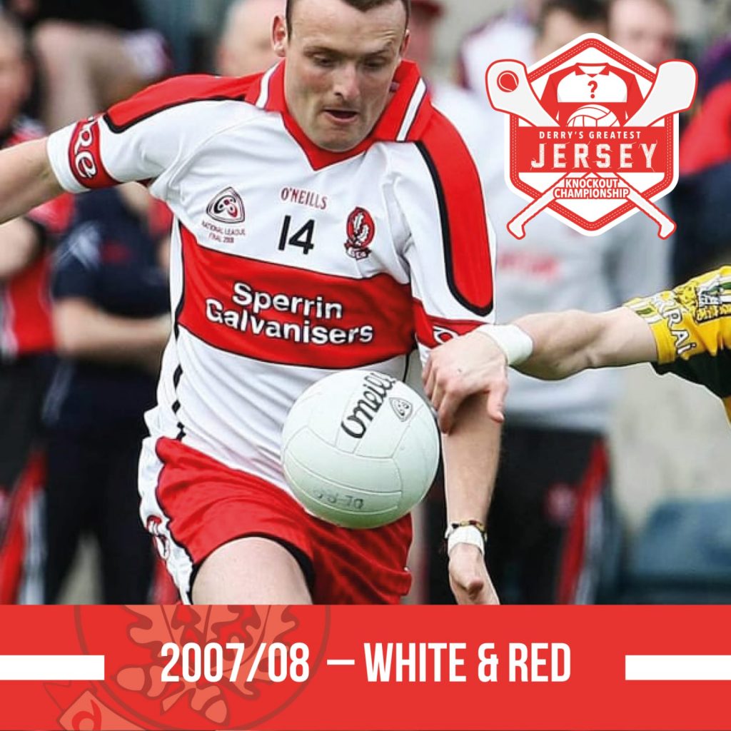
As worn en route to Football League Division 1 success in 2008 – there’s a lot to take in here, the red panels down the sleeves, white panels down the sides and the addition of black trim breaking up the red band make this quite a busy design.
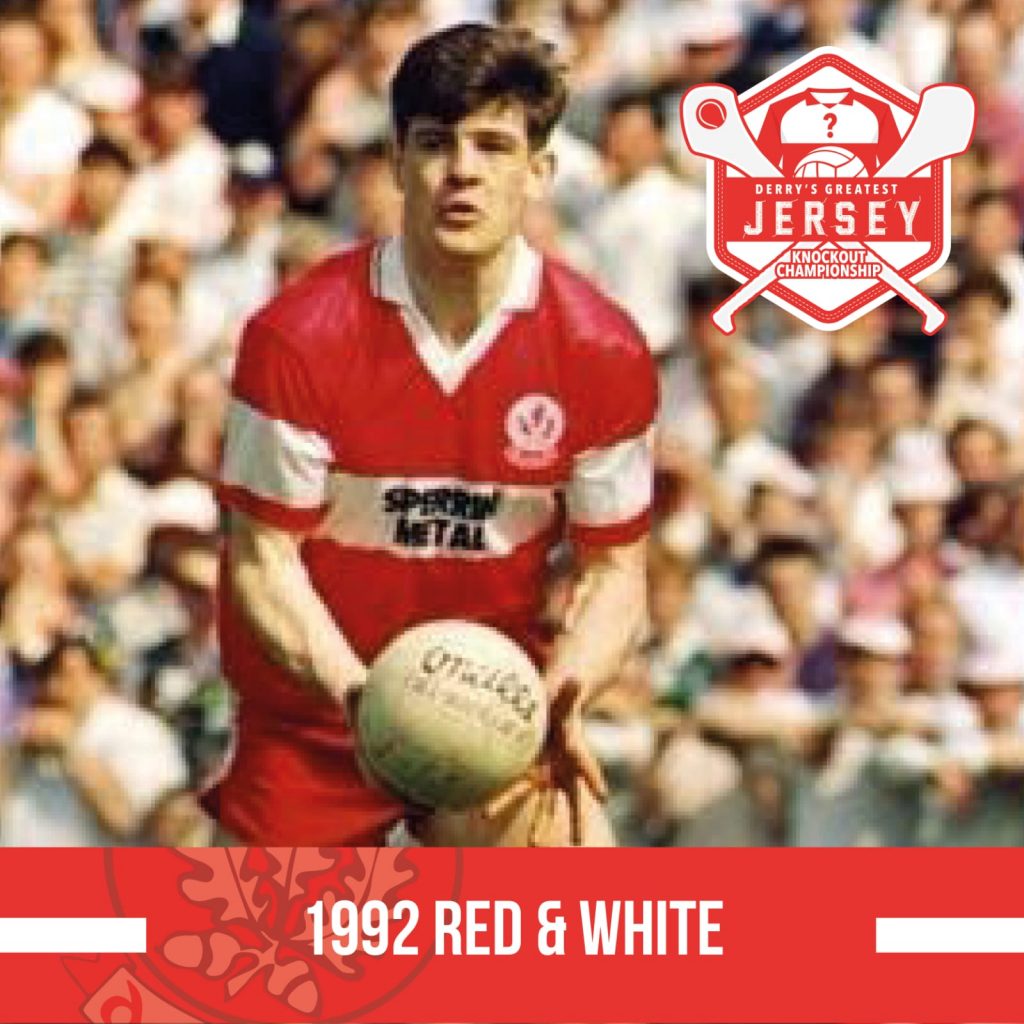
From Derry’s famous Championship win over Tyrone in 1992 – the first sight of the iconic Sperrin Metal sponsorship. This jersey looks the part but I’d imagine that shiny material didn’t exactly wick the sweat away.
WINNER: 2008
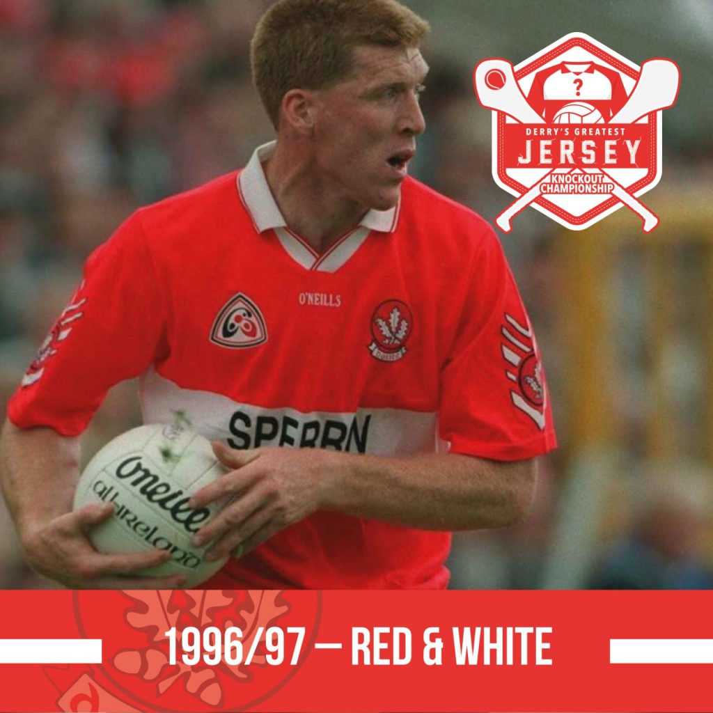
Matchup 3: 1997 v 1984
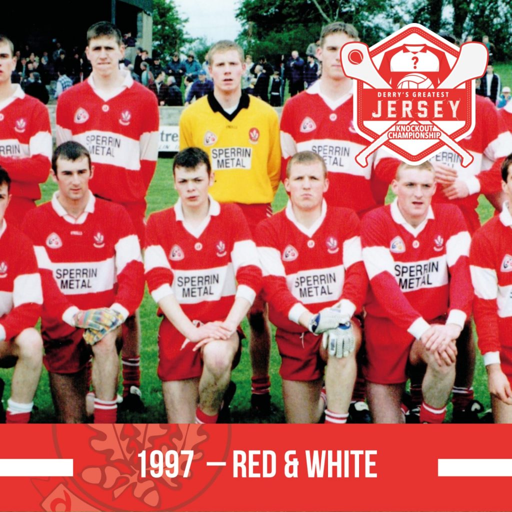
A red, long sleeve number as sported by our All Ireland U21 Champions in 1997 – the GAA logo; the Guaranteed Irish symbol; a plain white collar; simple red sleeves; no adornments. Sean Marty Lockhart and the 97 U21 lads cut a dash for the All-Ireland semi-final against Mayo.
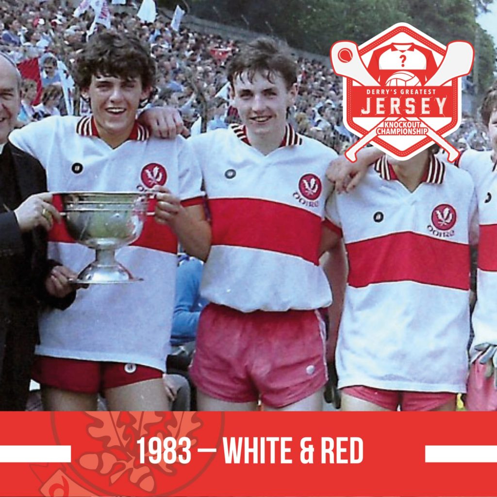
As worn by our 1984 Ulster Minor champions – the arrival of the iconic Oak Leaf crest, the guaranteed Irish branding and the three stripe collar, pretty much everything you’d want from a Derry geansai.
WINNER: 1984
Matchup 4: 2006 v 2020
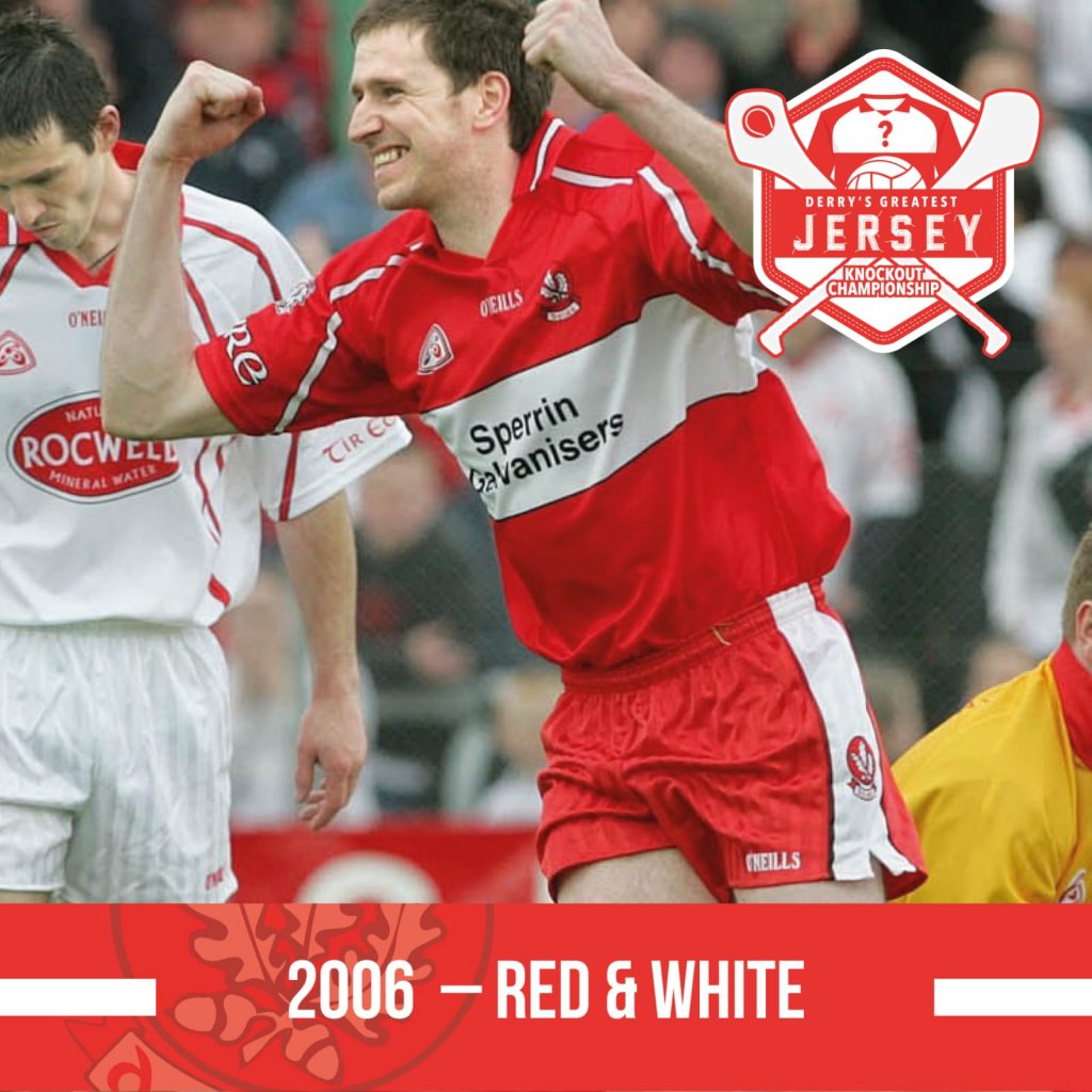
A red kit from 2004-2006 – this was the jersey we wore when we humbled our neighbours at Omagh in 2006. Given that player fit was fast approaching, the shirts of this era were quire baggy, again a relatively plain and pleasing effort.
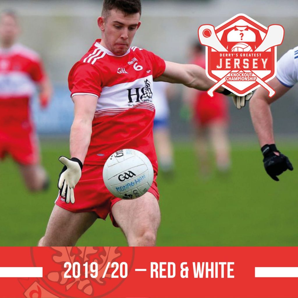
Our most recent red strip – three stripes at the top of the sleeve; plain white collar. Another design that shows simple is stylish. Little bit of detailing with the thin red bands fading out from the bottom of the white band.
WINNER: 2019/20
Matchup 5: 1996 v 2002
An Oak Leaf staple of the mid-90s – the red chevrons were a fixture on the sleeves of our shirts in that era. This one sports an early appearance of the first GAA corporate logo (which first appeared on shirts in 1995).
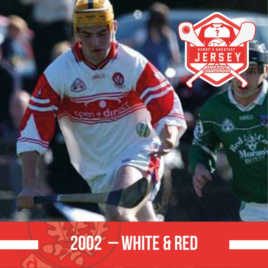
Worn only by our hurlers, in 2002 – it’s rare that there’s a difference between the hurling and football jerseys, other than maybe a variation in sponsor. But in 2002 our hurlers rocked a distinctive look for league games against Limerick and Offaly.
WINNER: 1996
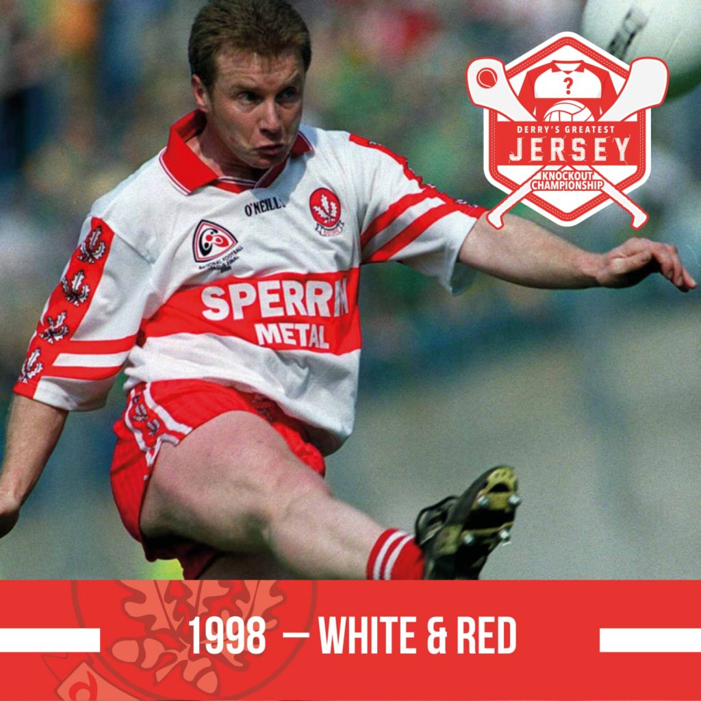
Matchup 6: 1975 v 1998
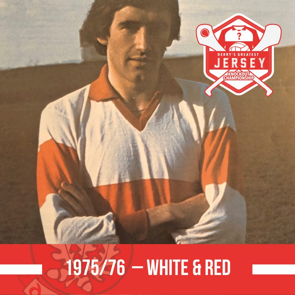
Our move to red shorts was definitely a step up in our overall aesthetic, the addition of the red colour lifts the jersey. Classy and effective just like Mickey Moran and the back to back Ulster winners who wore this shirt.
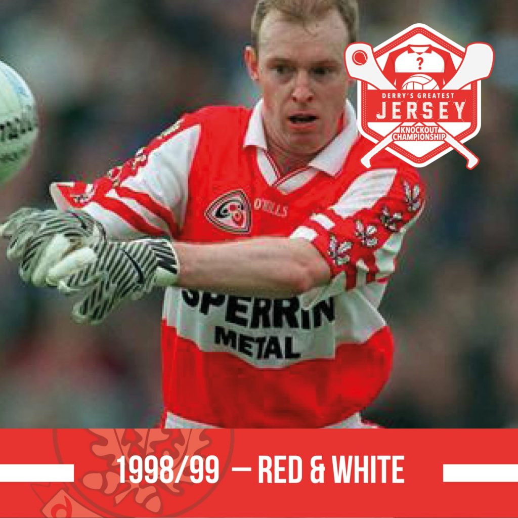
Our shirts at this stage where an odd hybrid, the body of the shirt was made of cotton while the very busy sleeves were made of a synthetic material. This alternative strip saw Derry appear in red jersey with white shorts.
WINNER: 1998
Matchup 7: 1970 v 1991
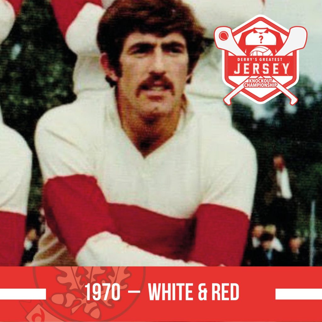
Hard not to get dazzled by Frankie Niblock’s, 1970 Burt Reynolds classic ‘tache, but there’s a lot to like about this clean minimalist Ulster final ensemble.
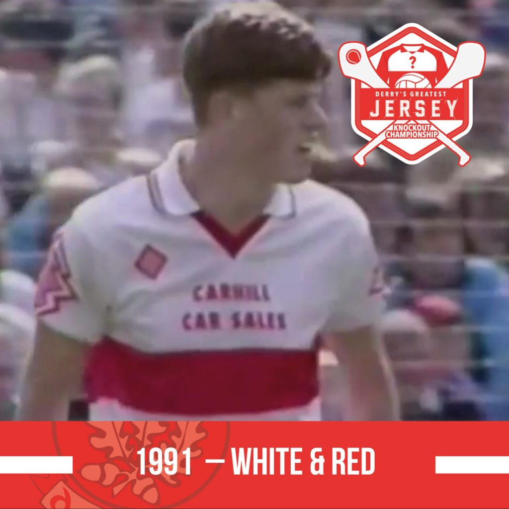
As worn by our footballers in the 1991 Ulster SFC campaign – acid house was big around this time and that might explain this somewhat ‘out there’ effort. The sponsor above rather than on the red bar is jarring; no Oak Leaf crest; and what looks like a red Christmas tree on the sleeve.
WINNER: 1970
Matchup 8: 1998 v 2020
We won our last Ulster Championship in this number. The busy sleeves aren’t as jarring as they were on the red version of this shirt but still quite a lot going on.
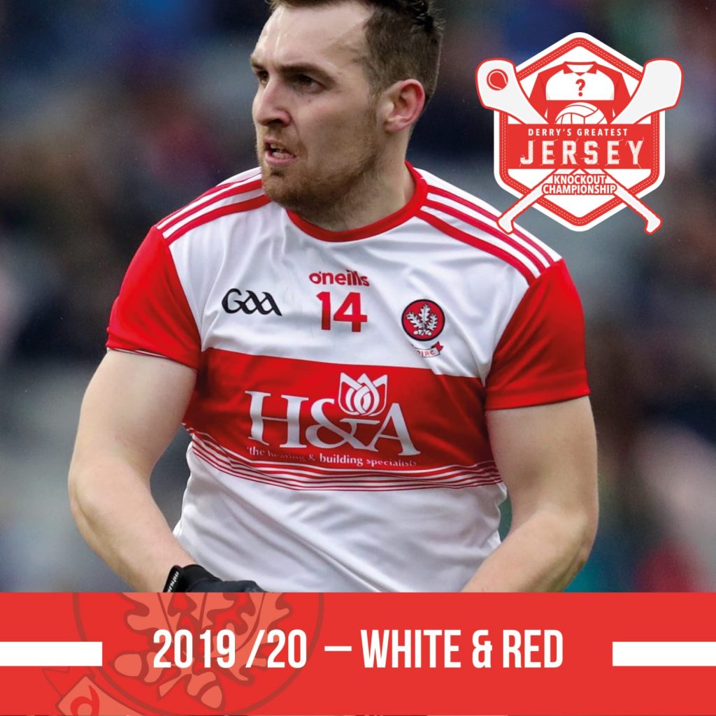
The red sleeves make a return. It’s a pretty classic look for a Derry shirt with the recurring white bands feature the one design quirk. The addition of a watermark on the rear was a nice touch.
WINNER: 2019/20
Matchup 9: 1993 v 2009
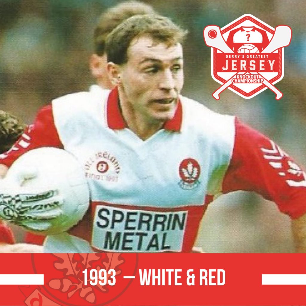
The jersey from our glory year could have been a contender… red sleeves with our white jersey for the first time. Perhaps it’s a bit spoiled by the unnecessary chevrons motif down the sleeves, but still a classic.
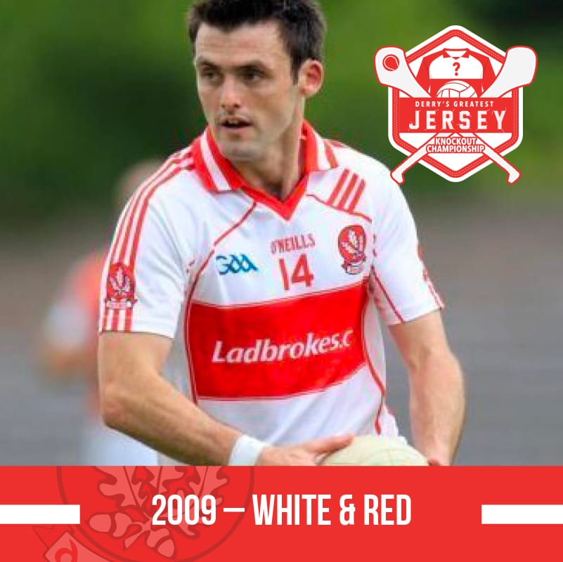
Still quite a busy jersey, a lot of design features going on but the three stripes motif running down the sleeve is a classic look. The GAA have updated their logo to the current one we all know.
Matchup 10: 1976 v 2001
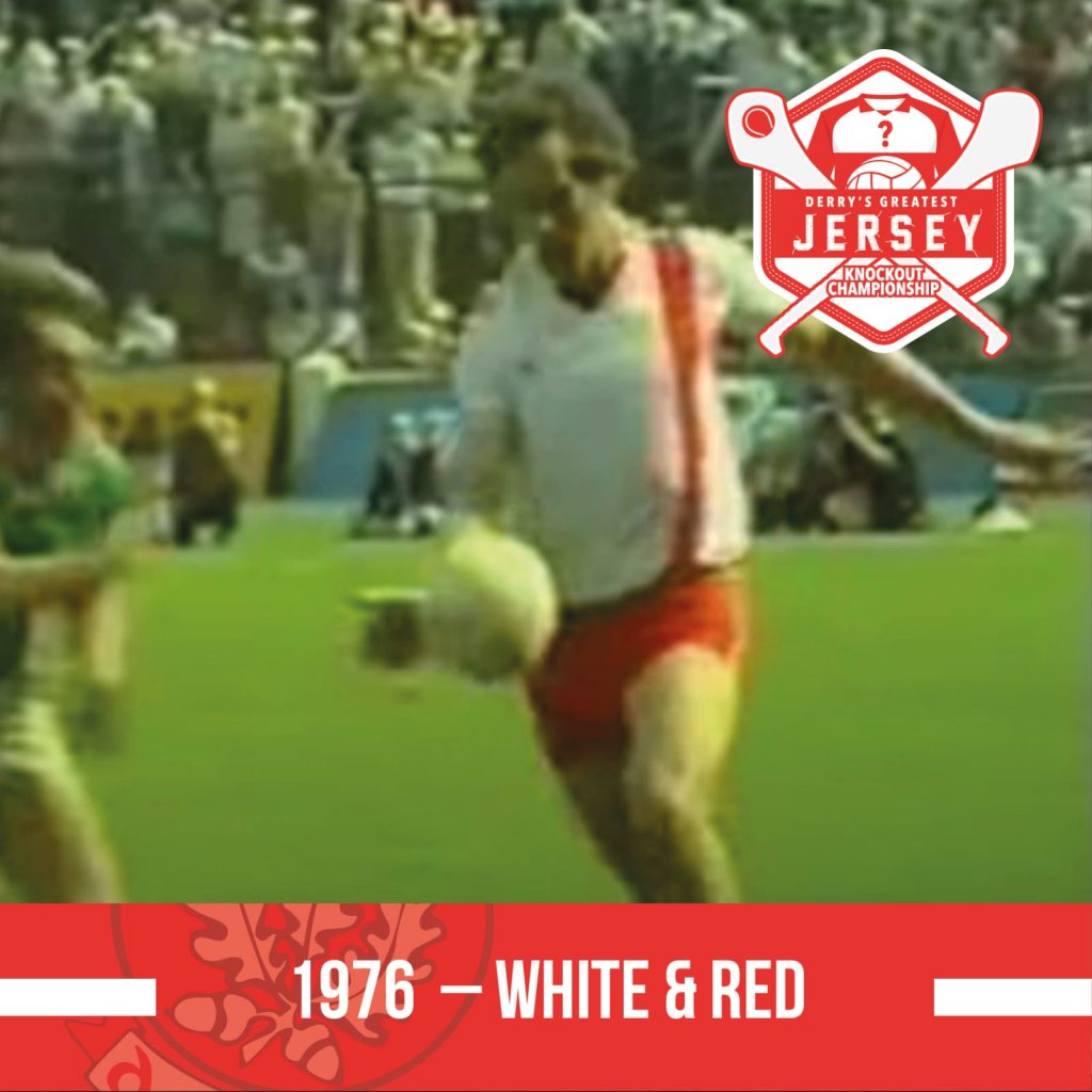
A one-off for the 1976 All-Ireland semi-final – a bit of rarity here, instead of the usual horizontal band we took to Croke Park against Kerry with a vertical red stripe down the left hand side of the jersey.
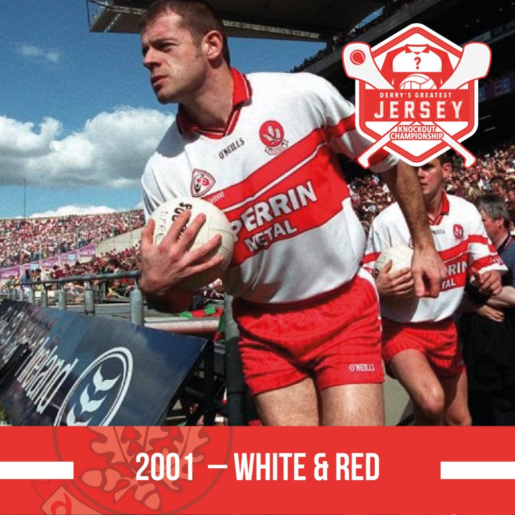
Is there a Derry jersey that wouldn’t look good on Anthony Tohill? The white version of this jersey is again quite busy but on this occasion it kind of works.
Matchup 11: 2012 v 1992
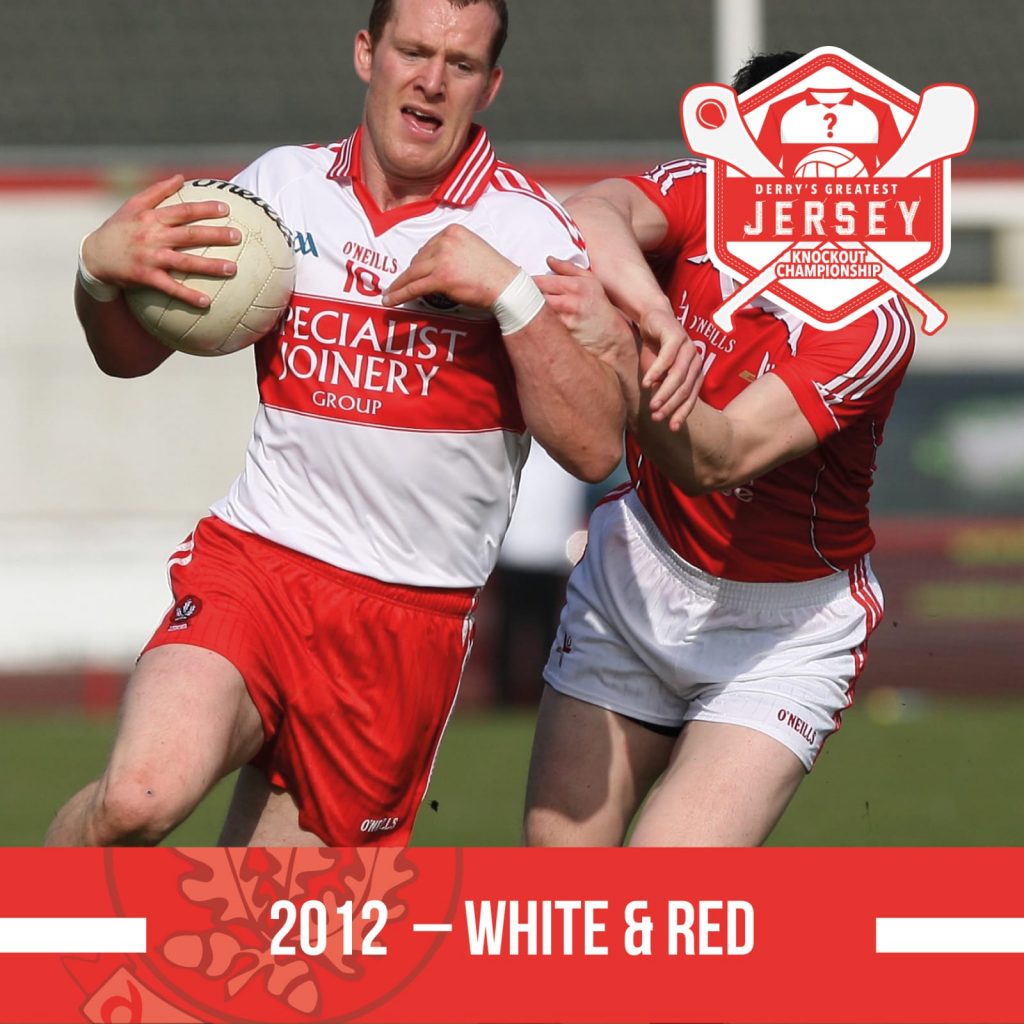
A very clean look with three stripes on the sleeves and the same effect on the collar. Some supporters took issue with this jersey as the red band across the front did not appear on the back and from distance the rear view looked like the previous season’s Tyrone jersey.
I think ‘busy’ is the most charitable thing to say here. The bouncing ball motif on the shoulder is a bit much, alongside the red flashes on the shoulders and the shiny material. Not our best effort.
Matchup 12: 1992 v 2014
Any jersey looks good when you are lifting a trophy on the steps of the Hogan, but this long sleeved red number is as high quality as the player wearing it. A top tier look.
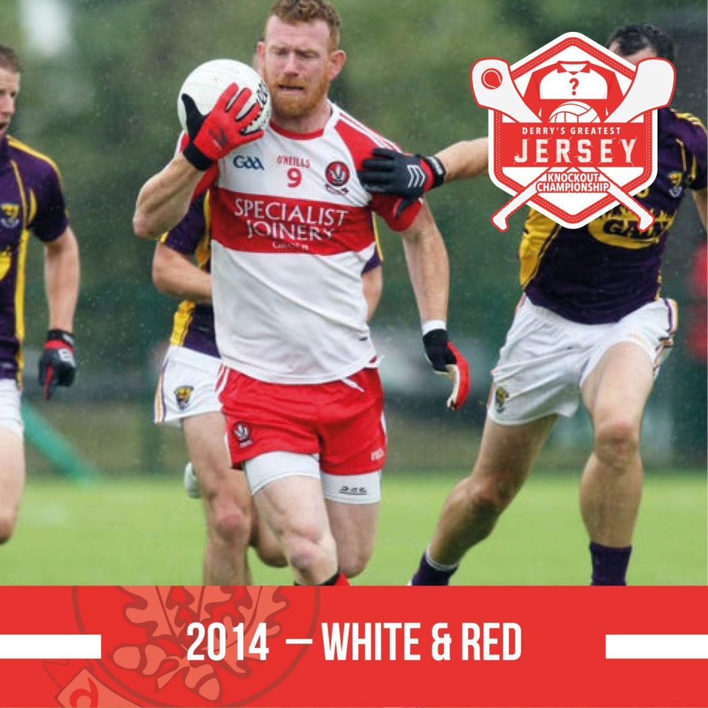
Red sleeves returned for the first time since 1997, a really clean look and a nice jersey this one.
Matchup 13: 2016 v 2020
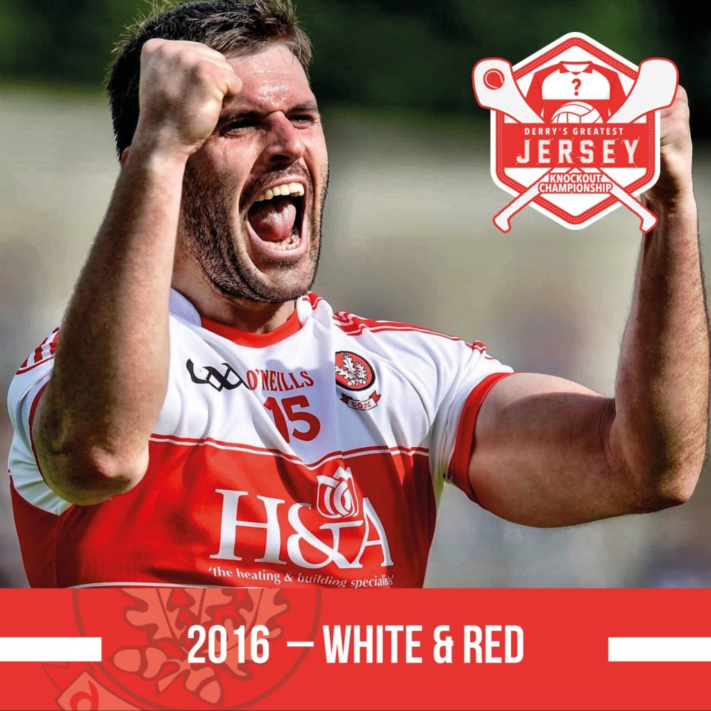
As well as reverting to the white sleeves, there’s extra red trim either side of the band and some detailing of a subtle circular pattern towards the bottom of the jersey.
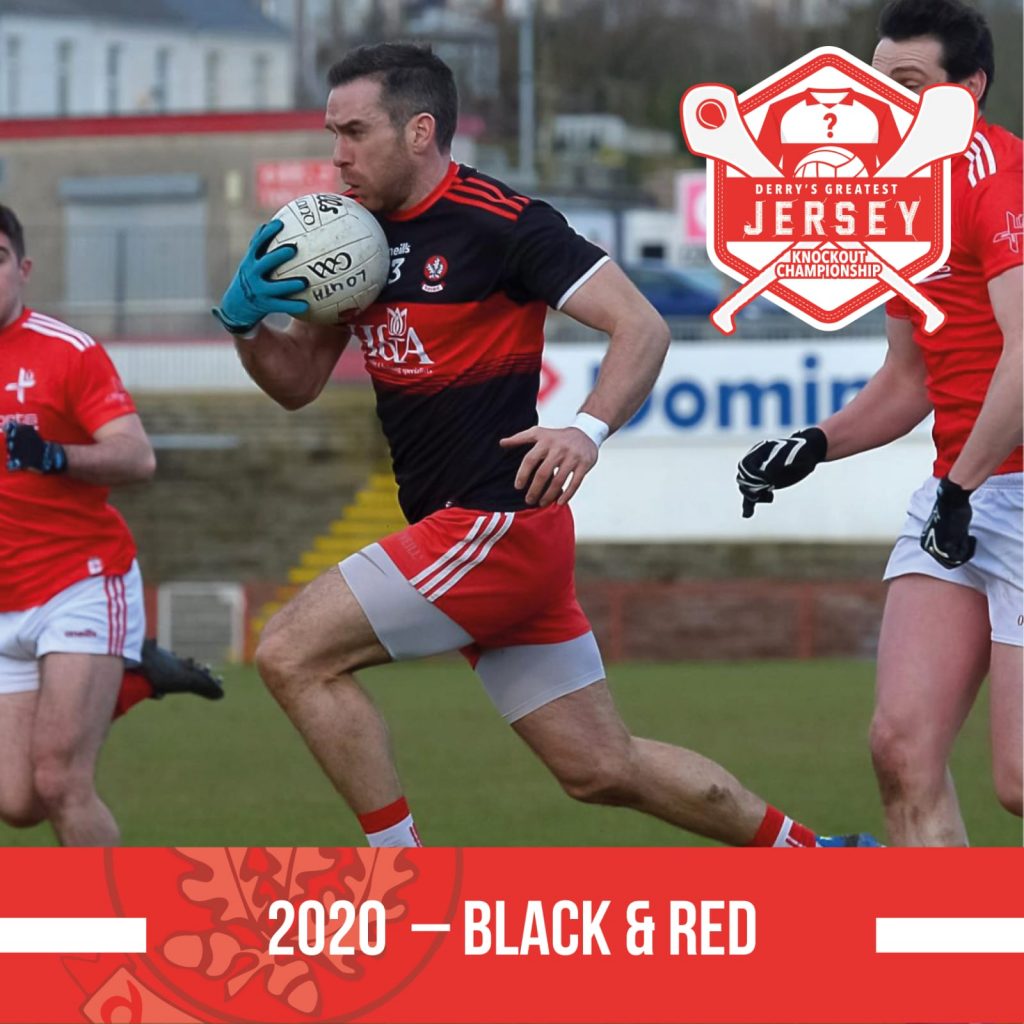
Designed to prevent a colour clash for Derry’s league game with Louth, this is certainly eye-catching and many folks like a black jersey but in the end it’s not really our colours.
Matchup 14: 1958 v 2001
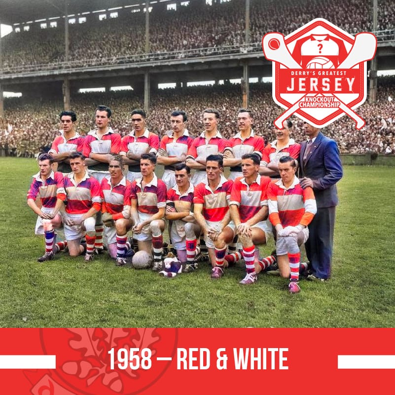
A vintage Red and White ensemble for Derry’s first ever appearance in an All Ireland Football Final, at Croke Park. Derry jerseys were originally red and white, until the predominantly white version appeared during the 1940s.
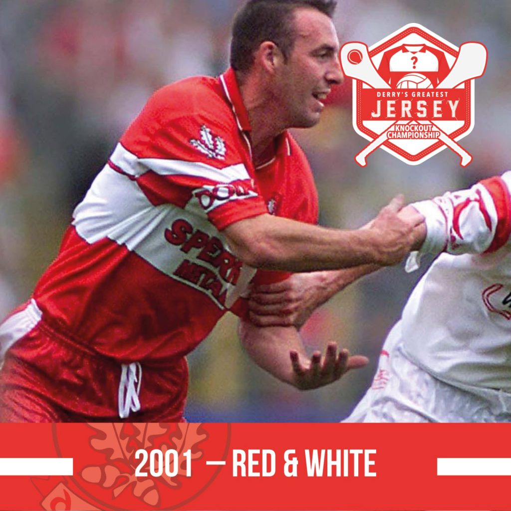
As we moved into the new millennium, technology allowed more complicated design features. Here the band across the middle of the shirt is split with chevron effect and the Oak Leaf motif on the sleeves.
Matchup 15: 1958 v 1995
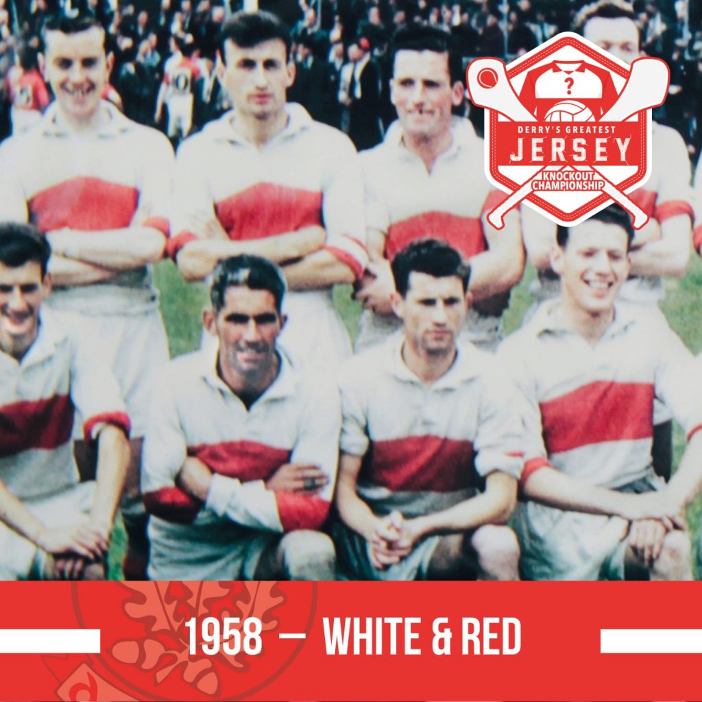
The earliest colour photo we have of a Derry team, from the 1958 Ulster Final. Rugby shirt feel to it and a classic look but you get the feeling it would weigh the guts of a stone by the end of wet February league game.
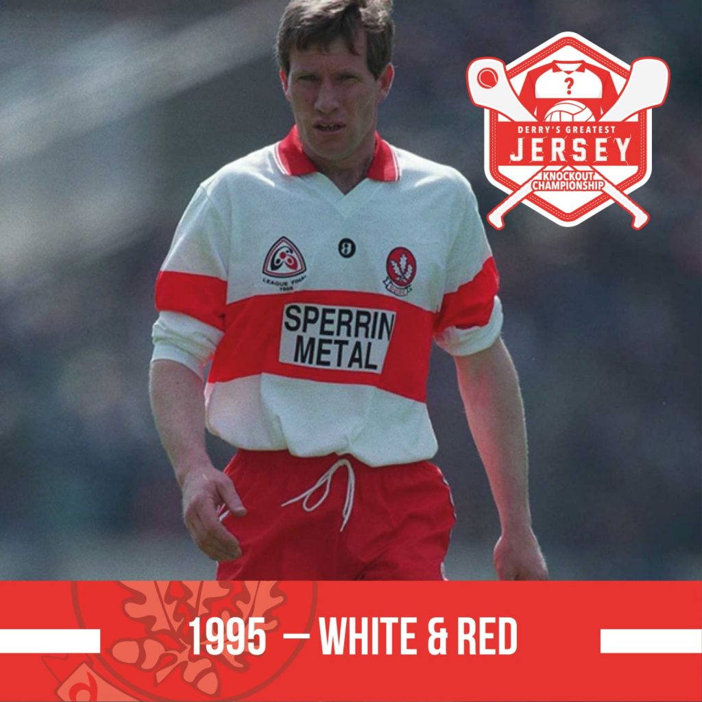
What’s not to like here? A classic. Let’s face it, if you’re corner-forward lining out against Tony Scullion with his sleeves rolled up you’re in trouble.
Matchup 16: 1985 v 2016
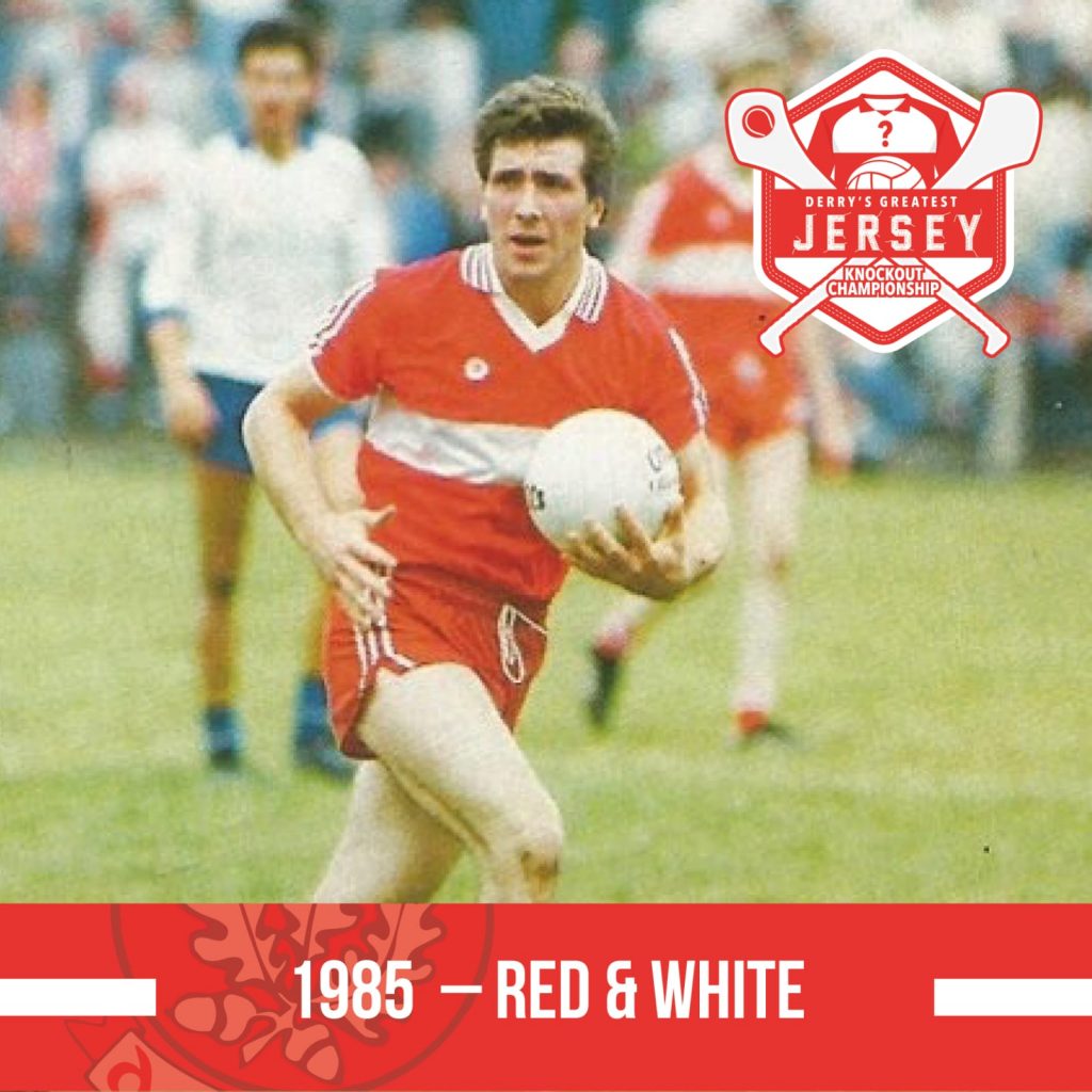
As worn in the 1985 Ulster final – it is the earliest predominantly red jersey on our list. The three stripe on the red sleeve looks well but odd to see the lack of the crest at this stage.
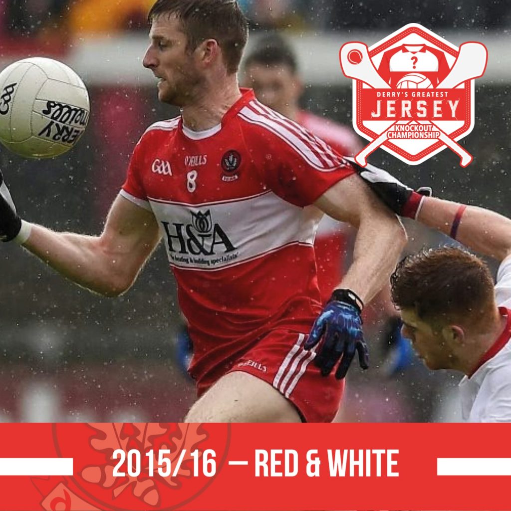
A change of sponsor with H&A on board for this season. The biggest change was the sleeves reverting back to the same colour as the rest of the jersey.